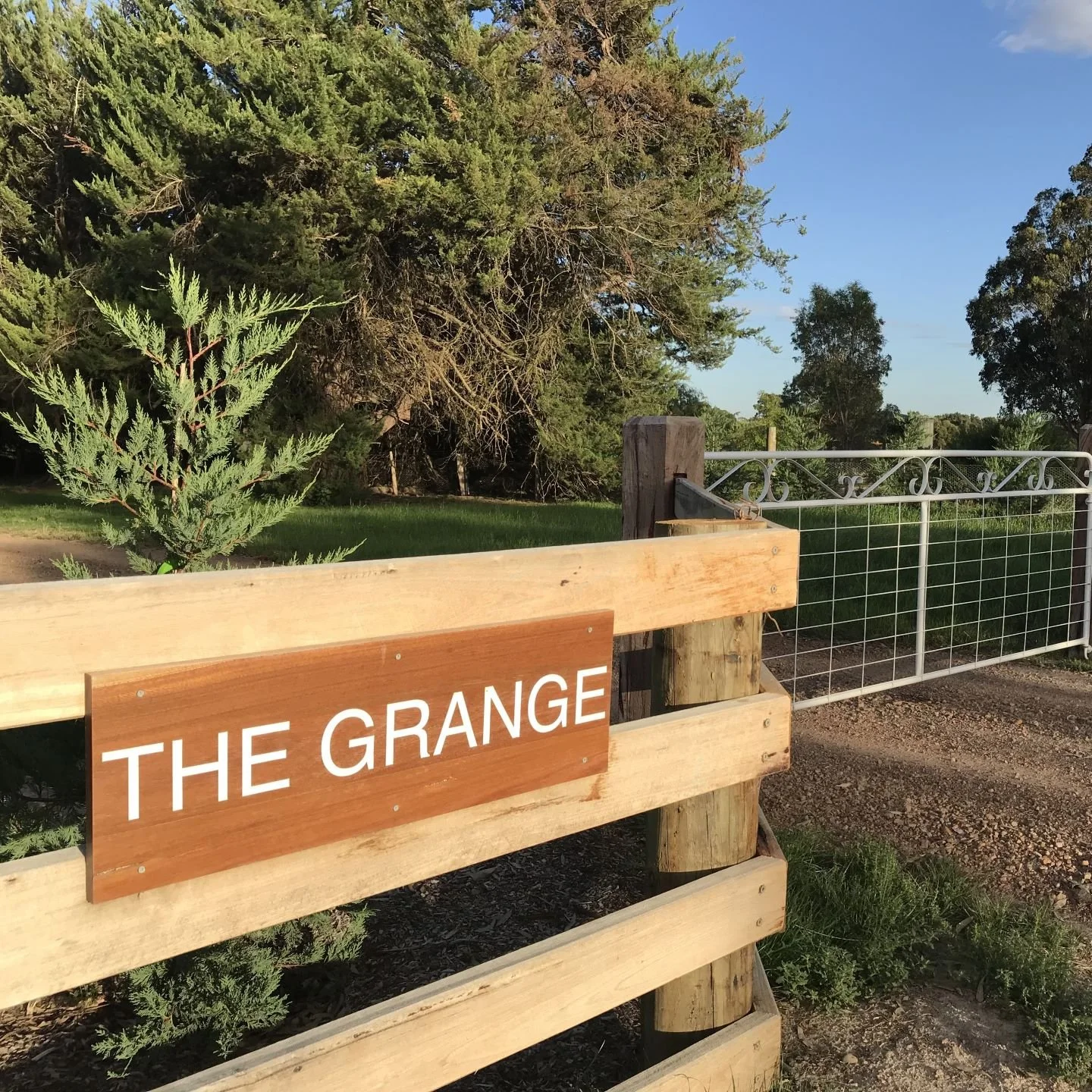
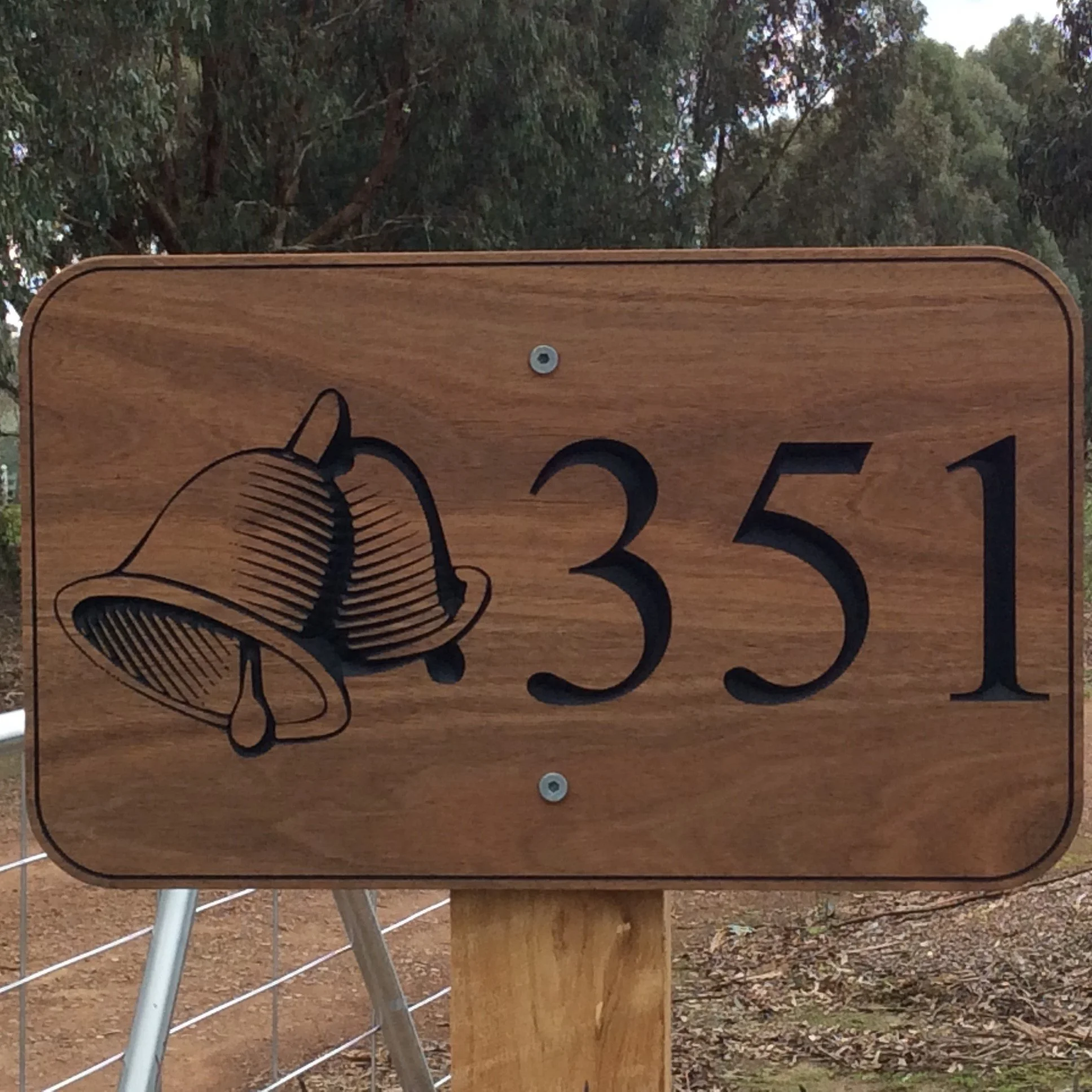
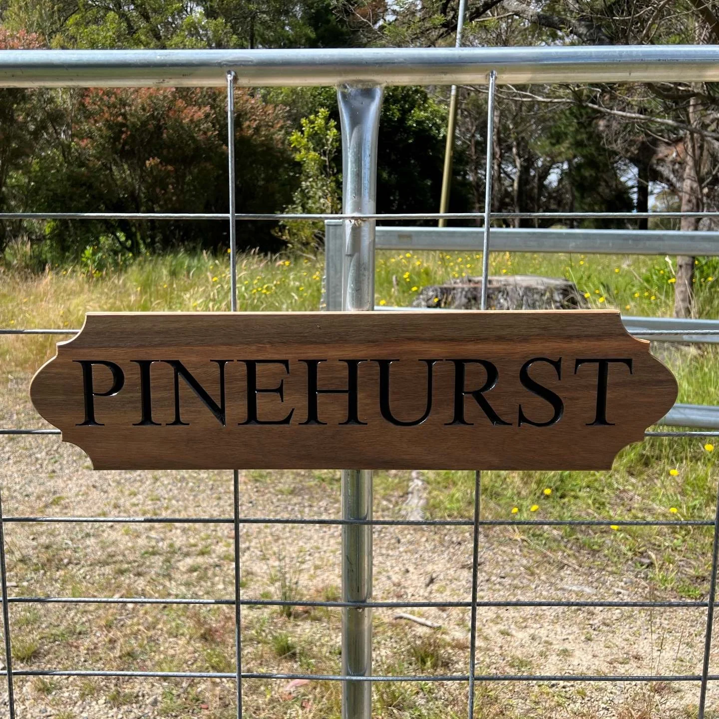
Best Fonts for Wooden House Signs: How to Choose the Right Style
When you’re ordering a custom timber sign, one of the first questions is: what’s the best font? The answer depends on where the sign will be placed, how far away it needs to be read, and the style you want for your home or property.
This guide explains how to choose a font for a wooden house sign that’s clear, stylish, and built to last outdoors.
Why Font Choice Matters for Timber Signs
Your wooden house sign is both decorative and functional. The right font:
Makes the sign easy to read from the street or driveway.
Matches the personality of your home — modern, rustic, coastal, or formal.
Ensures your timber sign looks professional and polished, not like a quick DIY project.
Outdoor Sign Readability Comes First
A house sign’s job is to be seen. Even the best-looking script font is useless if nobody can read it at a glance.
Choose bold, clear lettering for street numbers and property names.
Avoid thin or delicate scripts for long words — they can vanish when viewed from a distance.
Test at scale: a font that looks nice on a computer screen may not work when carved into timber at 100mm high.
Choosing a Font for Different Types of House Signs
Not every sign has the same purpose. Think about how yours will be used before deciding on a font.
Street numbers and address plaques: bold block or serif fonts.
Property or farm names: flowing script or heritage-style serif fonts add character.
Business signs: professional sans-serif fonts or bold serif fonts give clarity.
Gift signs (weddings, anniversaries): decorative cursive or elegant scripts create emotion.
Mixing Fonts: Script and Block Together
Pairing two fonts can create a striking result on a timber sign.
Block font + script: bold numbers or surname in a block font, with a softer script for a family name.
All caps vs title case: all caps can look strong for short words, but longer names are harder to read. Cursive scripts in particular tend to lose their charm in all caps — the flowing shapes become blocky and awkward.
Balance: contrast is key. Pair heavy with light, decorative with simple.
Matching Font Style to Property Personality
Your timber house sign should feel like part of your home.
Modern homes: clean sans-serif fonts suit contemporary architecture.
Rustic cottages or heritage houses: classic serif fonts with engraved depth.
Coastal or relaxed retreats: flowing handwritten scripts give a casual, welcoming look.
Formal properties: bold serif fonts that project authority and tradition.
Easy Online Design & Visuals
With our online design form, it’s simple to see your chosen wording in different fonts and layouts before your wooden sign is made. You select the options, view clear visuals, and confirm the style that fits your property.
Ready to Create Your Custom Timber Sign?
Our online design form makes it easy: Follow the visual prompts to select all your personalised options. Choosing fonts has never been simpler.


